Midnight Health  /  Telehealth  /  Three brands, one system

Three brands, one product.

A telehealth business running three consumer brands on three surfaces: the doctor's consult window, the patient's plan and store, and the pharmacy that fulfils what gets prescribed. One component library underneath all of it, themed per brand. I designed and maintained it solo.

Client
Midnight Health
Brands
Hub Health, Youly, Stagger
Role
Sole UX/UI designer
Platform
Desktop & mobile
Tools
Figma, Hotjar, GA
The Hub Health doctor platform on a laptop
Conversion
75%
First touchpoint to completed consultation
Platforms
3
Doctor, patient and pharmacy on one experience
Brands
3
Themed from one shared component library
01
The problem

Three brands that have to behave like one product.

Three consumer brands, each with its own audience and tone, sat on top of the same clinical machinery: a consult, a prescription, a fulfilment. Built separately, that becomes three products to maintain and three interfaces for a doctor to learn. Built as one, each brand still has to look like itself.

The patient surface carries the over-the-counter store as well, and it is not a separate shop bolted on: what a patient is shown follows from the consultation they just had.

02
Doctor
One window

The whole consult in one window.

Six views behind one window. A doctor moves between the patient's history, the prescription, the pathology request and the letter without losing the consult they are in.

Doctor platform  /  Desktop
Views
Home
View 01
Doctor platform: consult home
The consult queue and the day's bookings, so a doctor starts in the work rather than in a dashboard.
Medications
View 02
Doctor platform: medications
Prescribing against the patient record already open, not a separate prescribing tool.
Pathology
View 03
Doctor platform: pathology request
Requests raised inside the consult, with the result routing back to the same record.
Medical history
View 04
Doctor platform: clinical history
What the doctor needs before deciding, on the same screen as the decision.
Document writer
View 05
Doctor platform: document writer
Letters and certificates drafted in place, using details the record already holds.
Correspondence
View 06
Doctor platform: correspondence
One thread per patient, so a follow-up question does not start a new conversation.
03
Patient
Mobile first

A store that knows what the consult decided.

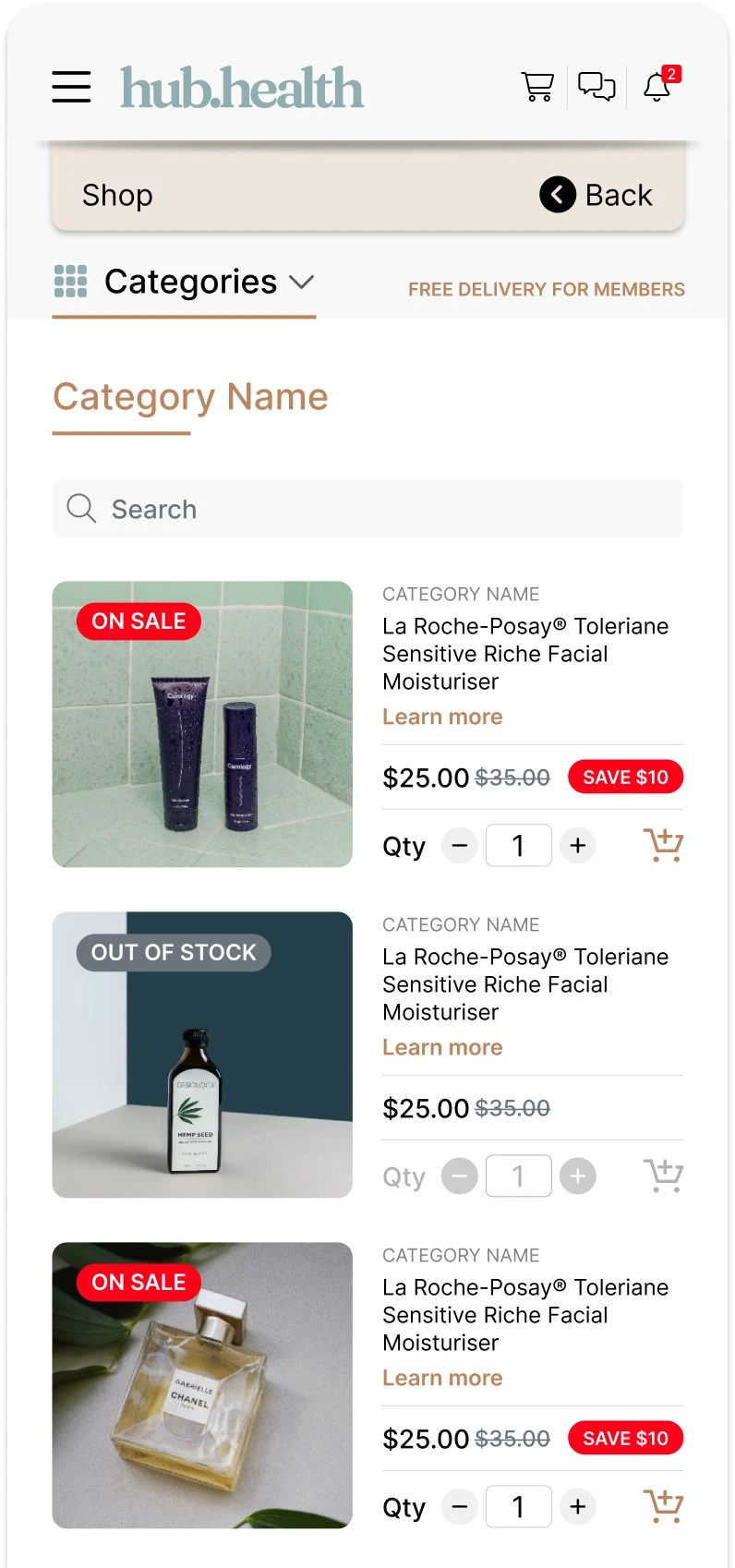
Patients track their plan, manage bookings and buy over-the-counter products from the same surface. The catalogue is filtered by what the consultation established, so the store reads as part of the care rather than an upsell beside it. Designed mobile first, since that is where nearly all of it happens.
Patient platform  /  Mobile
Patient store: category
Category. Filtered to what the consult established.
Patient store: product
Product. What it is for, before what it costs.
Patient store: cart
Cart. Prescription items and OTC in one basket.
Patient store: checkout
Checkout. The step the funnel was losing people at.
Patient store: featured products
Featured. Themed per brand from the same components.
04
Outcome

One system, and a funnel that moved because of it.

Shared patterns with brand-level theming meant a new brand was a theme rather than a build, and a doctor working across brands learned one interface. Over my time on the platform, conversion from a patient's first touchpoint to a completed consultation improved by 75 per cent, and two additional product lines launched with consultation and renewal journeys designed from zero.